A sales page audit service could be the difference between a lackluster cart open and a sold-out launch. Use it to optimize your sales page to increase conversions.
A sales page audit is a must-do activity when planning a launch or relaunch of a course, program, or product.
It needs to be crafted to sell. Because your sales page is the vehicle that helps you take your audience from prelaunch to paid. If the copy isn’t selling, then they aren’t buying. And wouldn’t that just be the worst. Slow or no sales. Especially when you know you have a valuable offer that can transform the lives of the right people.
But, how do you know if your sales page is optimized to convert?
That’s where I come in. And what we’ll be focusing on in the post.
You’ve done the hard work and created a course, product, or program that your audience has been clamoring for. Now it’s time to expand it to a wider audience to increase sales. And that starts with ensuring your sales page is ready to sell 24/7.
I’ve written or optimized hundreds of sales pages and continuously worked on my craft as a conversion copywriter. And I must tell you, I hate to see some of the mistakes we will look at in this post.
But the good thing is that once corrected, it’s amazing to see the results. Seemingly small tweaks to your messaging, copy, and layout can transform your sales page and increase conversions.
So, at the end of this post, you’ll know what conversion copywriters do when crafting a sales page. You can then do a quick assessment to see if your sales page hits the mark for these sales-optimizing elements.
You’ll also be able to tell if those sales page templates you see advertised are worth the money. Spoiler alert … many of those DIY templates leave much to be desired and a sales page audit is definitely in order.
But before we dive into these sales page audit tips, first ….
Table of Contents
ToggleWhat’s a sales page audit?
A sales page audit is a comprehensive review of your current sales copy and design with the goal of optimizing it to increase conversions.
It’s the process you undertake (or a complete funnel audit) if you want more sales. You check your sales page for barriers to conversion. Look for unintended blocks and limitations that prevent readers from choosing your offer.
With the right sales page audit, you can:
- Find the weaknesses that are affecting performance
- Ensure you’re using best practices in the copy and layout of your sales page
- Determine whether unclear messaging or inadequate CTAs are leaving money on the page
- Find opportunities for improving your sales copy to increase effectiveness
At the end of an audit, you should have a list of recommendations to implement. This may cover your messaging, copy, CTAs, layout, guarantees, proof elements, and credibility markers (testimonials, case studies, social proof).
Quick disclaimer: what a sales page audit – and this post – is not.
We’re not doing an on-page SEO audit of your website. We are not looking to optimize your sales page for search results. We want to improve conversions.
This also isn’t about a website audit.
Yes, you can adopt some of the principles we’ll be looking at to optimize other pages of your website.
However, this quick guide is specific to a sales page and is especially useful if you’re planning to launch (or relaunch) a product, course, or program. (Yes, you can and should be selling your high-ticket products using a sales page.)
And while this post doesn’t cover all 17 parts of my optimizing sales page audit service, it will give you a starting point to tackle some of the more important aspects of the conversion process.
Now, let’s get you ready to turn those hard-won visitors into customers and clients.
1. Getting started – where are your leads in the buying process?
To understand and respond to this question, you need to address your audience profile. This is where you should have started before writing anything. But if not, no worries.
So, the questions to ask are: Who are you speaking to? Who are your ideal clients/customers? What do they struggle with? What are their goals and aspirations? What have they tried before that hasn’t worked?
Understanding who they are will help you craft every element of your sales page to speak directly to their needs and goals. Where you can engage and connect with them on an emotional level. That’s the cross-section where conversion happens.
You also cannot assume that all readers landing on your sales page are at the same level of awareness. So, your copy has to address your readers where they’re at.
The best way to handle all these audience profile questions is by conducting Voice of Customer (VOC) research.
Use the VOC information to convey how your course or program can solve their problems or help them achieve their goals.
Plus, you can download my 7-Point Sales Page Framework that Converts for a deeper guide. It comes with with copy tips and additional examples not in this post.
2. Did you give them a reason to keep reading?
“Your hook/headline is the attention-grabbing, scroll-stopping words that engage and connect.” Yvette Haughton
The first thing your audience sees is the above-the-fold section of your sales page. But the primary focus of this section should not be the name of your offer! If it is, please go and amend it using the recommendations below.
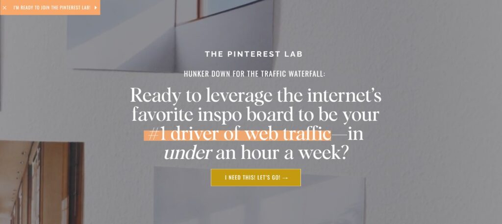
You need a sticky header that either addresses your audience’s pain point or speaks to their desires.
Take, for example, Jenna Kutcher’s Pinterest Lab sales page (2024). The name of the program isn’t the focal point of the section – it’s a call to her audience’s pain point – increasing traffic to their website fast.
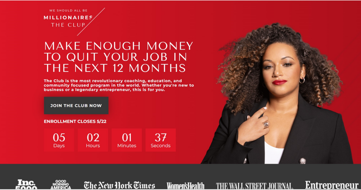
Another example is Hello Seven’s Millionaire Club sales page. Rachel Rodgers is openly speaking to her audience’s desire to be their own boss—to find ways to make enough money to quit their jobs in the next 12 months. (This above-the-fold section could be optimized, but that’s for another post. So, subscribe to the Prelaunch to Paid Newsletter to be notified when I publish my Millionaire Club sales page audit and breakdown.)
So, how can you tell if your headline or hook delivers the right message? What if you’re not sure if the message connects? Run a test through usertesting.com to see what others get from your hook and sub-content. Then, optimize if necessary.
In addition to your main heading, the headlines and sub-headlines throughout your sales page should continue to hook readers and keep them reading.
They should be clear, benefit-focused, and compelling enough to keep the reader scrolling. But also engaging, and leading closer to a conversion. Working through a sales page audit, this is one of the critical areas to check.
3. Is this the right offer for this audience?
You might have heard the saying benefits over features. Or features tell, benefits sell. But the truth is … neither is more important than the other.
Yes, you need both benefits and features. That’s how you sell the transformation you’re promising your audience.
Apple, for example, uses a long-form sales page format when selling its iPhones. Let’s look at the camera section of the sales page for its newest model, the 1Phone 15 Pro & Pro Max. Instead of leading with the feature – a 48MP main camera, it leads with a benefit – “a camera that captures your wildest imagination”.
But they did not forego mentioning the feature. Otherwise, how would you know what type of camera it is?

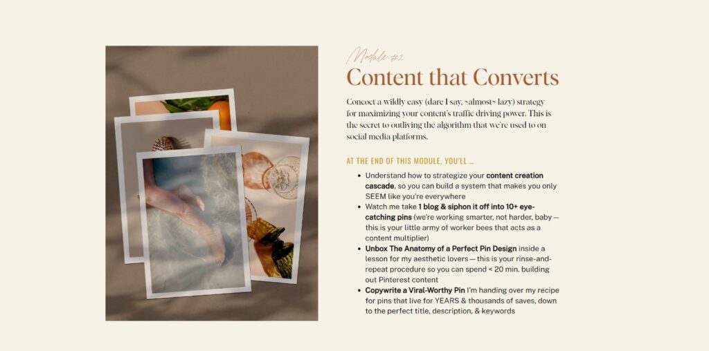
For a second example to illustrate this point, we’re using a section of Jenna’s Pinterest Lab sales page.
She doesn’t just list out only what’s included in each module of the program (aka the features). She highlights the benefits and takeaways students will enjoy from each section.
(I use other examples in my 7-Point Sales Page Framework and provide a copy tip on how to optimize this and the other sections of your sales page. So, make sure to download it here.)
An optimized offer leaves your audience believing in the dream you offer. Your features and benefits copy help to sell this transformation.
4. Why should your audience trust you with this offer?
Your Credibility Markers are key to helping your readers know, like, and trust you.
This can be social proof in the form of case studies and testimonials. You can also showcase proof of your expertise in what you offer. Real-life success stories and quotes from satisfied clients will boost confidence in your offer.
Take this testimonial from one of my lovely clients, for example. I use this testimonial as a lead for my Sales Page and Sales Email VIP Week service. It clearly shows a before-and-after perspective and what my clients can also expect when they sign up to get their sales page or launch emails written in a week.
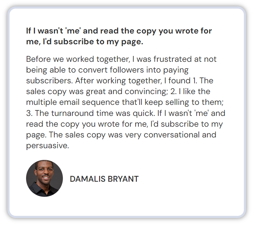
Likewise, you want clear before and after statements to show how what you do leads to the transformations your clients or customers need. Tick this off on your sales page audit checklist as you optimize your page for increased conversions.
Have a sales you want to get audited by a conversion copywriter?
5. What will it mean for them?
Your audience is all about what’s in it for them. How will the thing you promised affect their lives, and what will you do if it doesn’t go as planned?
You need to remove the barriers to buying and instilling trust in your audience.
So, what will it mean for them if they trust you?
That’s where your guarantee can make the difference between a yes or a no to your offer. The key to a guarantee that converts is:
- Branding it … aka giving it a catchy yet relevant name
- Limiting satisfaction only guarantees (means nothing really)
- Explaining what needs to happen for them to qualify for a guarantee
Jenna’s guarantee is a great example of these three principles in action.
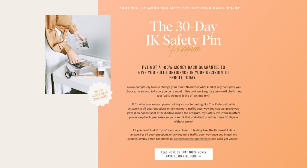
It’s a branded guarantee – “The 30-Day JK Safety Pin Promise,” which plays on the fact that it’s a Pinterest course. She offers a 30-day money-back guarantee. She goes further to explain why she’s offering it and how you can qualify if the program doesn’t work for you.
When conducting a sales page audit, make sure you don’t gloss over the guarantee. It could make or break your argument. And it could be a quick fix to amplify sales.
6. How should you handle objection busters?
“You sell on emotion, but you justify a purchase with logic.”
Joseph Sugarman
The next objection-busting section of your sales page audit process is the FAQs. This is where you merge logic and emotion to justify the sale.
One mistake I see on many sales pages is the heading “FAQ,” and then launching right into a list of questions – many of them irrelevant to getting your audience to act.
Again, this is a header section. Treat it as you’ve done the others with a scroll-stopping headline like what Copyhackers did for their 2023 Freelancing School re-launch sales page.
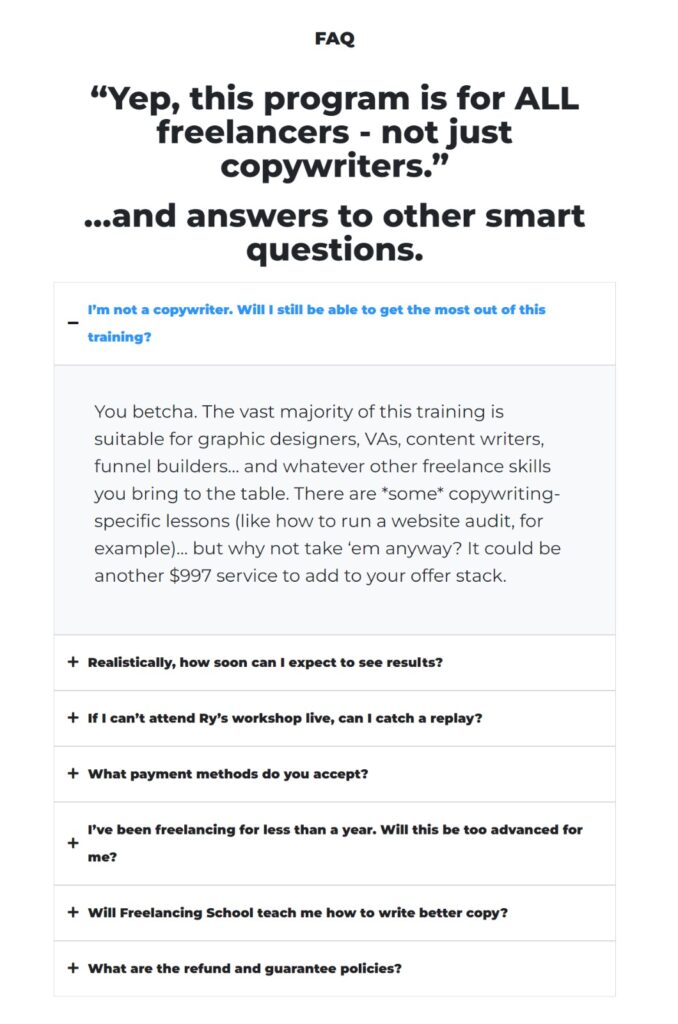
It highlights one of the top questions/pain points of their audience, pauses the scroll, and guides you to read the other questions that answer objections you may have about joining the program.
7. Are you asking for the sale?
Asking for the sale is more than putting a ‘buy now’ or ‘click here’ to enroll button in a different color on the page.
You’ll want to strategically place mini closes throughout your sales page? These are your Calls to Action or Calls to Value – the action you want your audience to take.
But you should frame it in a way that doesn’t seem like work and not that it’s going to cost them money. Yes, they’ll be paying you, but you want it to be an investment in their future self, not an expense that they’ll regret.
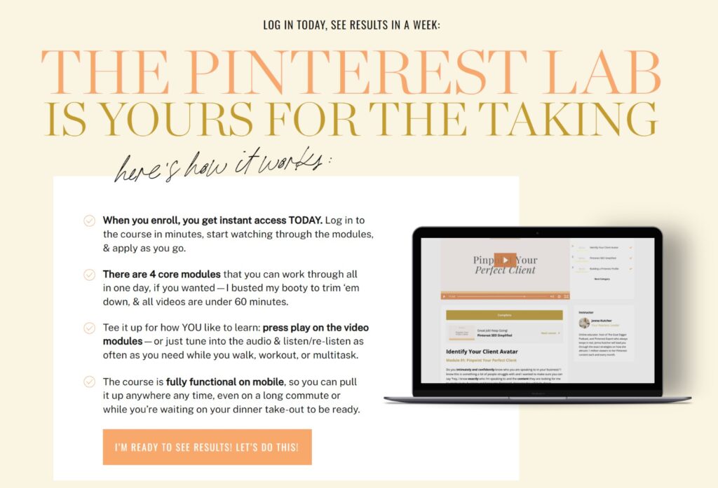
In this example, Jenna has two CTAs: one is a pre-header statement; the other, a button linked to the checkout page. The first invites readers to “Log in today, see results in a week.” This gives readers a definite timeline to start realizing the transformation promised. This first step is a simple action – logging into the course. Once you’re in, you’re naturally going to start watching a video.
The CTA button is actually a call to value. Readers clicking this button agree that they are ready for results and ready to start.
How about a few bonus sales page audit tips
In addition to the 7 essential areas, we tackled above, here are a few more quick sales page audit tips to enhance the effectiveness of your sales page.
- Test, analyze, and optimize different elements of your sales page on a regular basis (heatmaps, CTAs, testimonial placement, etc.)
- Remove all external links on your sales page except those leading to your checkout page (your website’s privacy policy, disclaimer, terms and conditions links at the bottom are the only exceptions)
- Powerful visuals or mockups can help support the copy, especially with a good balance of images/video with your sales copy
So, how was your sales page audit?
I’m sure this post has given you some ideas on how to go and optimize your sales page.
And why wouldn’t you? A compelling sales page is the cornerstone of a highly effective launch. It’s a key component of the prelaunch-to-paid process to help you convert your audience and readers into sales.
So, if you had a slow launch, it doesn’t mean all’s lost. No sales could mean you need to address your messaging. Or your guarantee or features and benefits sections need work. There are many quick fixes that being too close to your copy means you’re not seeing the apples of the trees.
Regularly auditing and optimizing your sales page can increase your conversion rates. Bringing in a launch strategist and conversion copywriter will definitely help.
Unlock even more sales page audit and optimizing tips with the 7-Point Sales Page Framework That Converts
Transform your sales page into a high-conversion asset for your business when you …
Download the 7-Point Sales Page Frameworkand follow the steps to improve your sales page copy to increase sales.
Now, I didn’t cover all 17 parts of my 17-point conversion checklist for irresistible sales page copy.
But follow these sales page audit steps, and you’ll be well on your way to optimizing your sales page. And if you have any questions, feel free to reach out to me and I’d be happy to help.
